on | 5 COMMENTS

Latest Logo Revision and a Great Site for Exploring Fonts

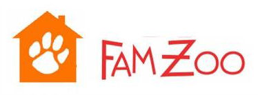
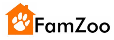
I have been iterating on the logo concept that I posted last week - the "hybrid icon" that combines a home symbol with a paw print to capture both the "Fam" and the "Zoo" in one clean, simple, yet unique visual. To be perfectly honest, I received both positive and negative feedback on the idea, but since I really like it myself, I decided to focus on the former and filter out the latter! I guess that's one of the nice things about being in charge... Besides, my wife likes it too - need I say more? I commissioned Paul from MotorG (the Elance designer behind my favorite submissions in the initial mockup round) to work up some color, font, and placement variations. I then did some cutting, pasting, placement, and font refinements of my own to come up with the latest revision. Here it is: Whaddya think? Please post comments. Some of the key design refinements and associated rationale are:
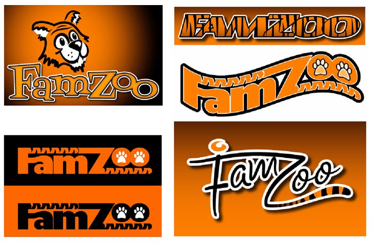
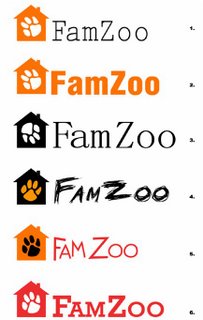
  • Color: I think the white paw on the colored house background coupled with the black text works best. The other combos (see bottom of post) feel too distracting or dark to me.
  • Paw print orientation: I like having the paw print slightly angled - it feels more "wild" and accentuates the contrast with the orderliness of the straight up-and-down, rectilinear house. I prefer the paw print to be heading toward the "FamZoo" and not away since I prefer to send the subliminal message that users will want to flock to FamZoo rather than flee from it!
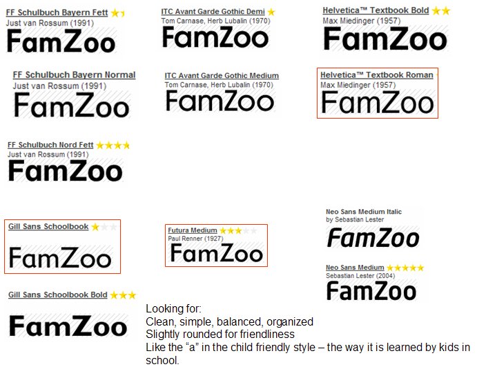
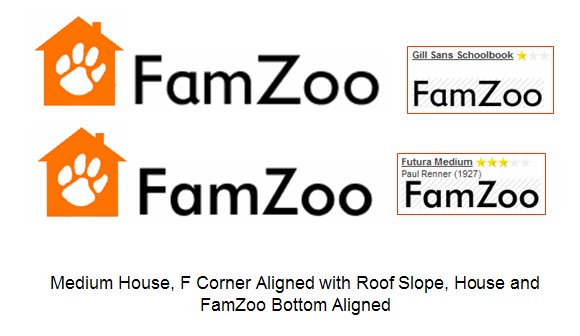
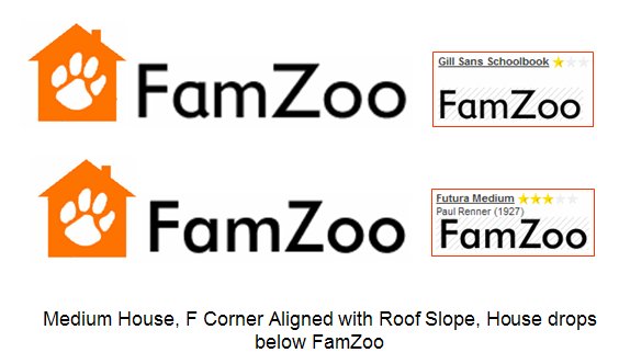
  • Font choice: For the font, I am looking for a combination of "responsible" (sturdy, symmetrical, clean) plus "child friendly" (somewhat rounded with a handwritten style lowercase "a" - the way kids learn to write in school) plus "modern" (since FamZoo leverages Internet technology). After browsing fonts for a couple of hours on the FontShop Web site (more about this site below), I settled on "Futura Medium". I also considered "Gill Sans Schoolbook", but ultimately decided that the flaired tail on the "a" gave it a weaker feel. I'm very open to other recommendations, but I feel this one does a pretty nice job of covering the three themes. I suspect it is weakest on the "modern" theme since the only particularly modern thing about it is probably its name. I like "Neo Sans Medium" as a more modern font, but it does not have the handwritten "a" style that I prefer.
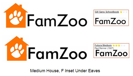
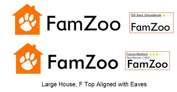
  • Icon size and placement: I experimented with a number of different options for the size and placement of the icon relative to the text (see bottom of post). I like having the icon and the text aligned horizontally instead of stacked vertically. I like the choice aesthetically, but it is also more economical from a vertical real estate standpoint which has practical benefits when it comes to Web page layout design down the road. I like having the icon larger than the text - seems like a bolder statement. As for the detailed alignment between the icon and the text, I ultimately chose to have the "F" in FamZoo evenly inset within the eaves, the side, and the bottom of the house. This frames the "F", gives the "F" a subtle sense of depth, and creates a nice integration between the icon and the text.
As you can see, I like having subtle but definitive reasons for each of the design decisions, even if few folks ever know about (or fully appreciate) them. I guess the engineer in me is showing ;-) 
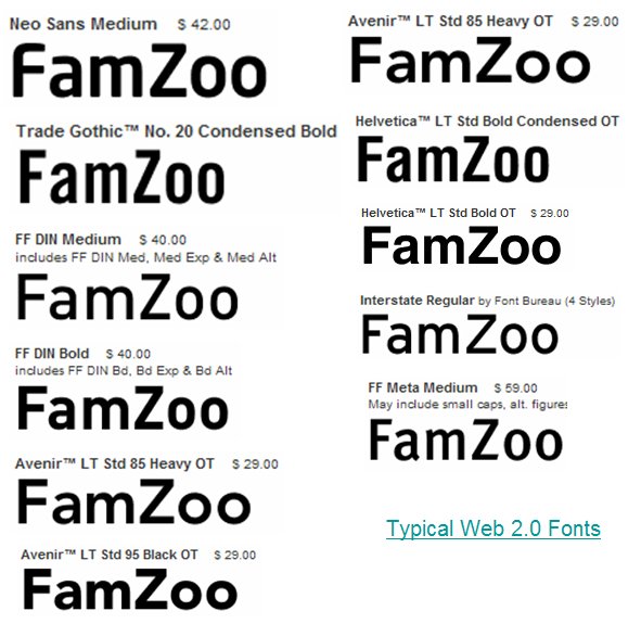
An aside about the font selection process: looking for some inspiration, I figured I would check out what the latest "Web 2.0" companies were doing in the logo design area, so I googled on "web 2.0 logos". The first hit was this excellent blog entry by Stephen Coles of the FontShop. It's a very interesting analysis of the fonts used by various "Web 2.0" brands. This blog entry ultimately led me to the FontShop's Type Navigator which they describe as the "world's first interactive visual font search system". If you are searching for a font, I highly recommend using this tool. When you generate your search results, don't forget to type your sample text (like "FamZoo") into the field at the top of the page and hit refresh. This will let you see exactly what your text will look like in each of the candidate fonts. Really cool and useful. 
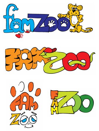
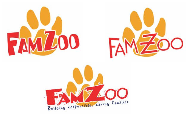
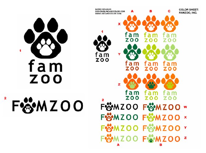
To give a full sense of the iterations over the past week, I'm including the revisions from Paul and my own subsequent iterations plus various font candidates I considered.
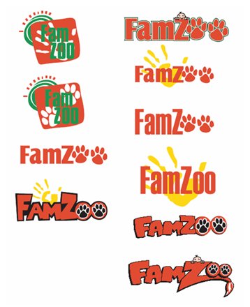
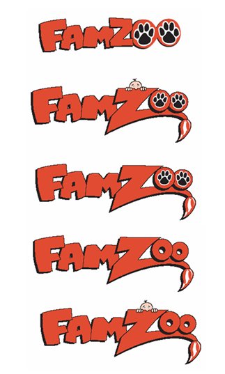
 Refinements from Paul at MotorG: First Round: Second Round: 
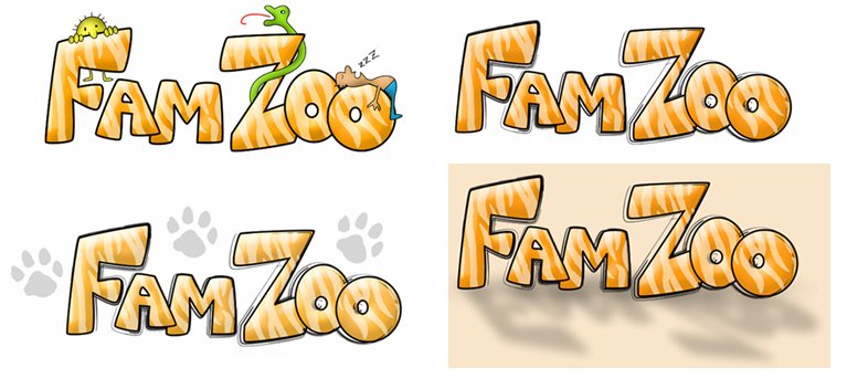
Some classic Web 2.0 Fonts from the FontShop blog post: Some of the fonts that made my shortlist after browsing: 
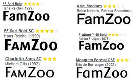
Some other fonts I considered: The various placements with my two top font choices On a final note, I'd like to acknowledge the extra and very professional efforts of Elance provider Adrienne Reitz for sending me some unsolicited concept refinements after reading the last blog posting. Adrienne is very professional and passionate about her craft - someone to consider if you go through this exercise yourself. 
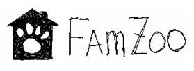
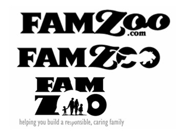
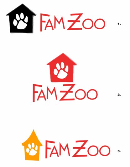
Update 11/9/06: In the comments on this post, Murali mentions a mockup that is a mashup of the lettering in MotorG submission #3 and my FamZoo icon. His goal is to restore a little more fun in the logo. Here is what he sent me:
on | 4 COMMENTS

My Favorite FamZoo Logo Concept Submission and a New Proposal

Many thanks to those of you who submitted comments and feedback on the initial FamZoo logo concepts. Your responses were extremely helpful.

First, let me reveal the submission that I favor most and why. I like elements of several of the submissions, but my favorite overall is the first one by MotorG (however, I would drop the tag line from the core logo). Here it is again for reference:

The reason I like this submission best is that it feels very clean and simple (I think it passes the "embroidery test" mentioned in my brother's comment). I also feel that depicting "famzoo" in a clean, regular font that is stamped over an irregular, wild paw print does a good job of capturing the mission of FamZoo (as described here) - i.e., overlaying some semblance of order and responsbility on our hectic and occasionally "wild" family lives. Refinements (beyond removing the tag line) might include trying different color combinations, experimenting with various clean orderly fonts, and perhaps capitalizing the "F" and the "Z" to match the official name of the company (although, lowercase may lend a more regular, balanced look - also it matches what people would type into a browser).

All that said, several of you registered concern about the logo concepts placing too much emphasis on the "zoo" vs the "family". Excellent feedback.

My wife as well as Jayesh and Malvika (see comment), have suggested incorporating a simple house icon as a clean representation of "family". I like that idea, but I was having a hard time giving up on the paw print (sorry Jer ;-).

I thought of a hybrid icon today that might address these concerns and still cater to my affinity for the tiger paw print. Below are scans of two very rough logo concepts that I sketched in my notebook moments ago:

I think the icon captures the idea of putting some order around the wildness by having the paw print within the confines of the house. I like how both "family" and "zoo" are represented in a single graphic. I like how the graphic can stand on its own without the company name, although I would definitely include "FamZoo" in the core logo. I think it passes the embroidery simplicity test and works even in black and white (still want color in it though). I think it is pretty unique - even if paw prints are somewhat overused in logos elsewhere. I'm not sure which orientation of text relative to the graphic I like most (to the right vs. below). I'm not sure what kind of font would be ideal. Nonetheless, I think this might be a good start on a concept...

What do you think? Please leave a comment if you have an opinion.

on | 13 COMMENTS

FamZoo Logo Concept Project Submissions

In my previous post, I described how I have been using Elance to generate a wide variety of rough concepts for the FamZoo logo. Here are the logo concept submissions I have received so far listed in alphabetical order by Elance provider user name. Please post comments regarding which ideas you like best and any refinements you would suggest. If you fancy yourself a graphic artist, feel free to submit your own ;-) Or, if you happen to know a logo designer who you think would do a fabulous job, feel free to leave a reference in your comment. Be kind. Remember, I paid for rough mock-ups (some more rough than others!) and not finished logos. Try to focus on the main ideas behind the rendering and not the initial execution per se. There will be significant polishing and refinement work between rough mock-up and final logo. I appreciate your feedback. 1) 5 Web Design (Elance username: 5webdesign) 5webdesign: Submission 1 2) Eye 4 Design (Elance username: AdrienneReitz) AdrienneReitz: Submission 1 3) AdrienneReitz: Submission 2 4) Designs That Work (Elance username: Designs_That_Work) Designs_That_Work: Submission 1 Designs_That_Work: Submission 2 5) DNA Dublin (Elance username: dnadublin) dnadublin: Submission 1 dnadublin: Submission 2 dnadublin: Submission 3 6) E-Genius (Elance username: e-genius) e-genius: Submission 1: 7) PolyChromia Graphics (Elance username: Gunnjg1) Gunnjg1: Submission 1 Gunnjg1: Submission 2 Gunnjg1: Submission 3 8) MotorG (Elance username: MotorG) MotorG: Submission 1 MotorG: Submission 2 9) Raewell Graphics (Elance username: raewellgraphics) raewellgraphics: Submission 1 10) Santa Fe 360 (Elance username: SF360) SF360: Submission 1 SF360: Submission 2 11) Line & Color (Elance username: VisualModality) VisualModality: Submission 1 VisualModality: Submission 2
on | 2 COMMENTS

FamZoo Logo Concept Project

Recently, I have been spending quite a bit of time thinking about the right logo for FamZoo - something that really captures the essence and style of the company. I'd like a style that appeals to both parents and children. I'd like a logo that is clean and simple, but not boring. I'd like it to be somewhat playful, yet still professional. I'd like a logo that symbolizes the key goals of FamZoo which are:

  • to help busy, modern families inject some consistency and structure into their occasionally wild, "zoo"-like lives (family lives subjected to the frenetic influences of dual working parents, constant "multitasking", blurred work/family boundaries, overloaded schedules, etc.)
  • to help parents introduce and encourage fiscally and socially responsible habits in children who are being regularly bombarded by an increasing array of self-indulgent and impulsive influences on the internet and elsewhere.
To ensure that I consider a wide range of creative input and minimize the risk of committing to a single designer or style too early, I have decided to try a little experiment. I am breaking the FamZoo logo design effort up into two phases - a concept phase and an execution phase. To generate a sufficiently broad array of rough logo ideas at a reasonable cost, I decided to post the concept phase project on Elance. Elance is an online marketplace that matches (typically small) business buyers with a global pool of providers (such as freelance logo designers). As mentioned in my first post, I am very familiar with Elance because I worked there for two and a half years prior to starting FamZoo.

You can see my Elance postings for the FamZoo Logo Concept Project (along with the associated bids from service providers) here and here.

I posted the projects in mid September and allowed bids to come in for a week. I received a total of 37 bids from logo designers around the world (Canada, Ireland, Argentina, Ukraine, Indonesia, Thailand, India, Romania, Poland, Slovenia, and all over the US). I then set about the fairly time consuming task of evaluating each of the bidders and winnowing the list from 37 down to 10. This took about 2 to 3 days. To keep track of the process, I created a simple scorecard in Excel and ranked each bidder on a set of weighted criteria:

  • how well the provider read and followed my bid instructions (weight=4),
  • my impression of the provider's portfolio (weight=10),
  • the number and quality of the provider's Elance buyer reviews (weight=10),
  • my perception of the provider's ability to communicate clearly (weight=8),
  • the size of the provider (I favored individual designers over larger firms since I felt I would get better individual attention and focus) (weight=7), and
  • an intangible scoring that captured how well I felt the provider "resonated" with the project based on preliminary communication during the bidding phase (weight=9).

On September 30, I awarded the project to the top 10 providers in my scorecard (and one "wildcard" provider who showed a particularly keen interest to participate). I negotiated concept fees with each provider individually (since most of the bids reflected the price for delivering a finished logo, whereas I was just interested in the rough concepts). I paid almost all of the providers up front as a show of good faith. (Payments are handled through the Elance payment system using, in my case, a credit card. Note: Elance is rolling out a nice escrow feature shortly that will really enhance the payment experience for both parties, particularly for larger transactions with multiple milestones - see the announcement here.) 10 of the 11 awarded providers accepted the project and started working on their concept submissions.

Over the course of the last 2 weeks, all of the concept submissions have come in (one provider is working on one last revision cycle). Most providers did 1 to 2 rounds of revisions after receiving feedback from me on their first submissions.

In my next post, I will show all of the logo concept submissions and solicit feedback from friends and colleagues.