 2) Eye 4 Design (Elance username: AdrienneReitz)
AdrienneReitz: Submission 1
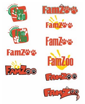 3) AdrienneReitz: Submission 2
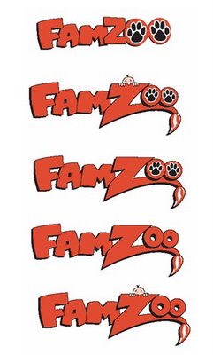 4) Designs That Work (Elance username: Designs_That_Work)
Designs_That_Work: Submission 1
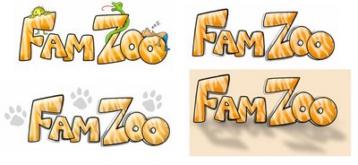 Designs_That_Work: Submission 2
 5) DNA Dublin (Elance username: dnadublin)
dnadublin: Submission 1
 dnadublin: Submission 2
 dnadublin: Submission 3
 6) E-Genius (Elance username: e-genius)
e-genius: Submission 1:
 7) PolyChromia Graphics (Elance username: Gunnjg1)
Gunnjg1: Submission 1
 Gunnjg1: Submission 2
 Gunnjg1: Submission 3
 8) MotorG (Elance username: MotorG)
MotorG: Submission 1
 MotorG: Submission 2
 9) Raewell Graphics (Elance username: raewellgraphics)
raewellgraphics: Submission 1
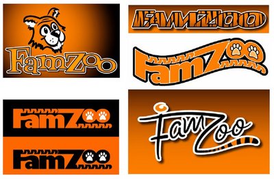 10) Santa Fe 360 (Elance username: SF360)
SF360: Submission 1
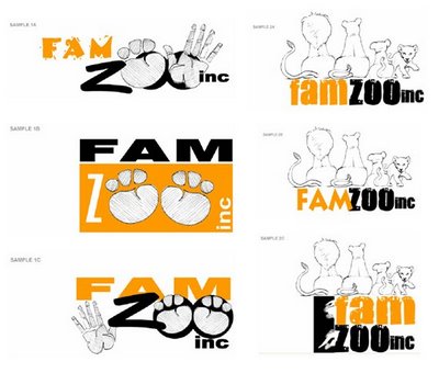 SF360: Submission 2
 11) Line & Color (Elance username: VisualModality)
VisualModality: Submission 1
 VisualModality: Submission 2


 Newer Post

13 comments:
wow! These are all fantastic logos. If FamZoo were particularly animal focused, this would be a tough choice. Both Christine and I felt that give FamZoo's Family focus, the animal based logos were too distracting from the mission.
We liked:
Designs_That_Work: Submission 2
because of the families, although they may be hard to reproduce in differnt sizes.
Would love to see more logos with family bent to them. Hope this helps!
These are all creative, but most put the accent mostly on the "ZOO" part of FamZoo. I thought the accent should be reversed, to be on the "FAM" part. That is, mostly family with a zoo-esque touch. The one I liked the best out of these was the last image of "DNA Dublin's" submission 1 since it had a family that was large enough to see. I didn't really like that in the middle "O" in ZOO" was missing, though. I think the artists should think more along the lines of "Family *AT* the Zoo" instead of "Family *AS* a Zoo". The image that popped into my head that might work requires imagining one of those painted wooden "photo opportunity" structures at the zoo that have animals painted on them with ovals cut out where your kids put their faces inside so they look like they are the face of a lion or a chimpanzee. I could see a logo where kids (a boy and a girl) were peeking their faces out of the two letter O's in "Zoo" (maybe with the parents poking their heads out of other letters or snapping a picture or something that made it clear the family was having a fun time together, at the zoo).
It's really interesting how so many of them use paws. I see a couple using tails, and eyes. But mostly paws--not sure what this says about designers. :)
Definitely simpler is better, you need something that will work when quite small.
I like
- Designs_That_Work, submission 2, the last one
- e-genius, submission 1, styles D and E (but lose the paw and change the "F" in E, looks like the grade F!)
- VisualModality, submission 2
Overall, I say lose the paws--you won't be able to tell what the heck they are at small dimensions (is that a foot? a flower?). Also a lot of colleges use paws like that (Missouri Tigers, etc.).
I like the idea of putting eyes in the O's in Zoo, but that may be tough, only one person tried it and it didn't seem to work.
Be careful with color and font selection. You'll have to live with the colors for a long time, and you'll have to always use colors on the rest of your site that fit with the logo colors. Make sure you really like the colors you pick and don't box yourself in.
Same with fonts--stick with a standard if possible, it just makes life easier.
Very cool!
Comments from my father (via e-mail):
When it comes to logos, I like simplicity, coupled with the ability to be rendered in both B & W as well as color (and preferably only one color in addition to black or white). You will be placing your logos on paper, T-shirts, labels, etc., etc. Multiple colors multipIy the costs involved needlessly. I prefer the logos that are focused on the family part of the name. Therefore, of the ones illustrated, I prefer Designs that Work, Submission 2, line 2 and Dublin, Submission 1, line 3.
Comments from my mother:
I guess I do have "Blogophopia", since it took me quite a while to figure out just how to read your blogs and see the various logos, I thought I better just e-mail. First I was interested in how this competition all works through Elance.....surely there must be some opportunity to capitalize on this in a business way. But most importantly loved the various inputs you received - I agree with many of the comments that although paws and animals are fun, may be too much emphasis on the "zoo" and not enough on "family" and this may also detract from the more professional response needed for a real business. Colors need to be given careful consideration - remember just how long it took to sell the "pumpkin" colored car your father had and colors can become boring and lose their effectiveness. I would suggest that you definitely give Don a heads up on what you are doing and ask for his input.
Mom
Fabio,
To answer your question: Will likes Designs_That_Work Submission 2, bottom logo (the cartoon block lettering with no adornments).
Bill
Andy,
To answer your question about target market: the target usage market includes kids (typically starting around 6 up through teenagers) and their parents. The business model will likely involve a nominal subscription fee for advanced services beyond the basic free service; therefore, the target buyer is the parent. (Advertising is a possibility, but would only be shown on parent pages if at all.)
Bill
Bill -- Just took a quick look and read through the comments.
Keeping your design simple and not 'cute' with primary colors will make your life a lot easier in the future.
Keep your emphasis on the Family and not on the Zoo because your objective is to help families 'navigate' this wild wonderful world we are all a part of. You may want to consider the lettering created by Sparky Schulz for the Peanuts Gang because it has style and at the same time simplicity and appeals to adults and children....
Frazz
I like dnadublins designs alot
Bill,
What about Will's logo mockup ?
In response to the last question: Will's cartoons (http://www.willtoons.com) will be featured within the pages on the site.
Bill
Its fun to look at the logos and all the insightful feedback !
In terms of simplicity and incorporating the concepts you outlined in the doc, we like raewellgraphics - submission 1 - bottom right.
You might also want to consider building the shape of a house into the logo design to depict "family". Seems like it would convey the idea in a less cluttered way.
Wishing you a very Happy Diwali :)
-Jayesh and Malvika
Bill, Here's my unvarnished two cents.
1 all) Too zooish, no tie to your company goals
2 all) Starts to bring in family but nothing to tie in fiscal responsibility
3 all) Same as 2
4 sub 1) color schemes are soothing
4 sub 2) good family tie in but too many micro images. Will be hard to reproduce and still doesn't cover anything around fiscal mgmt
5 sub 1) Last item of 3 was getting closer from a concept perspective and incorporates your tag line, I assume
5 sub 2 & 3) Went too far out in the wilderness
6 all) If you were opening a shelter for lost animals, these would be an interesting start. Particularly, item C if you were looking to provide mating services.
7 sub 1) Very creative, I do like the second one a little bit but still doesn't pull in fiscal mgmt
7 sub 2) Still too zooy for me
7 sub 3) The second one is getting closer to including family but the logo needs some softening/creativity. If they could inject some money symbols or bills in the logo, it could be an interesting approach
8 sub 1) If you were planning on selling the next set of Granimals clothing, you'd be all set with this logo
8 sub 2) the big paw reminds me of the "Don't Feed The Bears" signs around Yellowstone
9 all) These are very creative, imho, but still off the mark
10 all) I still think they don't pull in the mix of family, busy lives, responsible vision for the future. Considering all of these were backside images of the den.
11 all) Again focussed on paws vs goals.
Hope this helps,
Vince Casarez
Post a Comment