I have been iterating on the
logo concept that I posted last week - the "hybrid icon" that combines a home symbol with a paw print to capture both the "Fam" and the "Zoo" in one clean, simple, yet unique visual. To be perfectly honest, I received both positive and negative feedback on the idea, but since I really like it myself, I decided to focus on the former and filter out the latter! I guess that's one of the nice things about being in charge... Besides, my wife likes it too - need I say more?
I commissioned Paul from
MotorG (the
Elance designer behind my favorite submissions in the
initial mockup round) to work up some color, font, and placement variations. I then did some cutting, pasting, placement, and font refinements of my own to come up with the latest revision. Here it is:
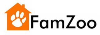
Whaddya think? Please post comments.
Some of the key design refinements and associated rationale are:
- Color: I think the white paw on the colored house background coupled with the black text works best. The other combos (see bottom of post) feel too distracting or dark to me.
- Paw print orientation: I like having the paw print slightly angled - it feels more "wild" and accentuates the contrast with the orderliness of the straight up-and-down, rectilinear house. I prefer the paw print to be heading toward the "FamZoo" and not away since I prefer to send the subliminal message that users will want to flock to FamZoo rather than flee from it!
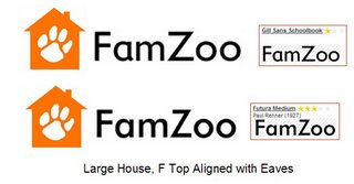
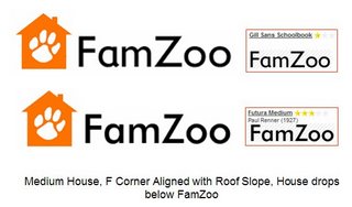
- Font choice: For the font, I am looking for a combination of "responsible" (sturdy, symmetrical, clean) plus "child friendly" (somewhat rounded with a handwritten style lowercase "a" - the way kids learn to write in school) plus "modern" (since FamZoo leverages Internet technology). After browsing fonts for a couple of hours on the FontShop Web site (more about this site below), I settled on "Futura Medium". I also considered "Gill Sans Schoolbook", but ultimately decided that the flaired tail on the "a" gave it a weaker feel. I'm very open to other recommendations, but I feel this one does a pretty nice job of covering the three themes. I suspect it is weakest on the "modern" theme since the only particularly modern thing about it is probably its name. I like "Neo Sans Medium" as a more modern font, but it does not have the handwritten "a" style that I prefer.
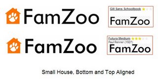
- Icon size and placement: I experimented with a number of different options for the size and placement of the icon relative to the text (see bottom of post). I like having the icon and the text aligned horizontally instead of stacked vertically. I like the choice aesthetically, but it is also more economical from a vertical real estate standpoint which has practical benefits when it comes to Web page layout design down the road. I like having the icon larger than the text - seems like a bolder statement. As for the detailed alignment between the icon and the text, I ultimately chose to have the "F" in FamZoo evenly inset within the eaves, the side, and the bottom of the house. This frames the "F", gives the "F" a subtle sense of depth, and creates a nice integration between the icon and the text.
As you can see, I like having subtle but definitive reasons for each of the design decisions, even if few folks ever know about (or fully appreciate) them. I guess the engineer in me is showing ;-)
An aside about the font selection process: looking for some inspiration, I figured I would check out what the latest "Web 2.0" companies were doing in the logo design area, so I googled on "web 2.0 logos". The first hit was this
excellent blog entry by Stephen Coles of the FontShop. It's a very interesting analysis of the fonts used by various "Web 2.0" brands. This blog entry ultimately led me to the FontShop's
Type Navigator which they describe as the "world's first interactive visual font search system". If you are searching for a font, I highly recommend using this tool. When you generate your search results, don't forget to type your sample text (like "FamZoo") into the field at the top of the page and hit refresh. This will let you see exactly what your text will look like in each of the candidate fonts. Really cool and useful.
To give a full sense of the iterations over the past week, I'm including the revisions from Paul and my own subsequent iterations plus various font candidates I considered.
Refinements from
Paul at MotorG:
First Round:

Second Round:
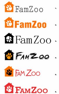
Some classic Web 2.0 Fonts from the FontShop blog post:

Some of the fonts that made my shortlist after browsing:

Some other fonts I considered:

The various placements with my two top font choices


On a final note, I'd like to acknowledge the extra and very professional efforts of Elance provider
Adrienne Reitz for sending me some unsolicited concept refinements after reading the last blog posting. Adrienne is very professional and passionate about her craft - someone to consider if you go through this exercise yourself.
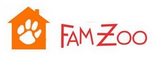
Update 11/9/06: In the comments on this post, Murali mentions a mockup that is a mashup of the lettering in MotorG submission #3 and my FamZoo icon. His goal is to restore a little more fun in the logo. Here is what he sent me:
 Whaddya think? Please post comments.
Some of the key design refinements and associated rationale are:
 Second Round:
 Some classic Web 2.0 Fonts from the FontShop blog post:
 Some of the fonts that made my shortlist after browsing:
 Some other fonts I considered:
 The various placements with my two top font choices


 On a final note, I'd like to acknowledge the extra and very professional efforts of Elance provider Adrienne Reitz for sending me some unsolicited concept refinements after reading the last blog posting. Adrienne is very professional and passionate about her craft - someone to consider if you go through this exercise yourself.
Update 11/9/06: In the comments on this post, Murali mentions a mockup that is a mashup of the lettering in MotorG submission #3 and my FamZoo icon. His goal is to restore a little more fun in the logo. Here is what he sent me:


 Newer Post

5 comments:
Feedback from my brother:
I'd try increasing the space between the house and the F.
Also, I think the chimney could be 1.5 to 2 times wider.
This logo accomplishes two things for me: 1) the house has become the representation of the family (which previous logos didn't address), and 2) the paw print reads as a figurative representation of family members rather than of animals in a zoo. I like it! Nice font and good color too - they express what you were trying to achieve.
I do agree with Mark's comments about the spacing of the 'F', and I might also vote for lining up the writing with the house.
Shnita
I like the combination of teh current logo and a #3 from teh fiorst round. Will send you my mockup by email.
Murali
I like your latest revision. Definitely prefer the paw print slanted to the right. I agree with your brother on the width of the chimney. Not too keen on the current font. Needs softer edges, much like amazon.com, yahoo.com, or blogger.com's logo.
hey Bill, found the link while clearing email - did you finish your logo? karl dnadublin
Post a Comment