Many thanks to those of you who submitted comments and feedback on the initial FamZoo logo concepts. Your responses were extremely helpful.
First, let me reveal the submission that I favor most and why. I like elements of several of the submissions, but my favorite overall is the first one by MotorG (however, I would drop the tag line from the core logo). Here it is again for reference:
 The reason I like this submission best is that it feels very clean and simple (I think it passes the "embroidery test" mentioned in my brother's comment). I also feel that depicting "famzoo" in a clean, regular font that is stamped over an irregular, wild paw print does a good job of capturing the mission of FamZoo (as described here) - i.e., overlaying some semblance of order and responsbility on our hectic and occasionally "wild" family lives. Refinements (beyond removing the tag line) might include trying different color combinations, experimenting with various clean orderly fonts, and perhaps capitalizing the "F" and the "Z" to match the official name of the company (although, lowercase may lend a more regular, balanced look - also it matches what people would type into a browser).
All that said, several of you registered concern about the logo concepts placing too much emphasis on the "zoo" vs the "family". Excellent feedback.
My wife as well as Jayesh and Malvika (see comment), have suggested incorporating a simple house icon as a clean representation of "family". I like that idea, but I was having a hard time giving up on the paw print (sorry Jer ;-).
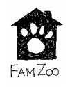
I thought of a hybrid icon today that might address these concerns and still cater to my affinity for the tiger paw print. Below are scans of two very rough logo concepts that I sketched in my notebook moments ago:

 I think the icon captures the idea of putting some order around the wildness by having the paw print within the confines of the house. I like how both "family" and "zoo" are represented in a single graphic. I like how the graphic can stand on its own without the company name, although I would definitely include "FamZoo" in the core logo. I think it passes the embroidery simplicity test and works even in black and white (still want color in it though). I think it is pretty unique - even if paw prints are somewhat overused in logos elsewhere. I'm not sure which orientation of text relative to the graphic I like most (to the right vs. below). I'm not sure what kind of font would be ideal. Nonetheless, I think this might be a good start on a concept...
What do you think? Please leave a comment if you have an opinion.

 Newer Post

4 comments:
I think the house-with-paw works better than the submitted paw logo you liked. It might be even better if the four paw "toes" had little eyes and a smile mouths. Four heads, one body? (maybe that's kooky...) But there you go...
Ummm, yeah, I'd say that's kinda kooky Steve... ;-)
I love the paw/house graphic. It says everything.
Big paw works well because you can tell it's a paw. :) Also I like the colors, leaves your options open.
Post a Comment